





Responsive Web Design Explained
Responsive web design is no longer an optional feature—it is a necessity. In today’s digital world, people browse websites using smartphones, tablets, laptops, desktops, smart TVs, and many other devices with different screen sizes. A website that looks perfect on a desktop but breaks on a mobile phone can frustrate users and negatively impact business growth.
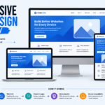
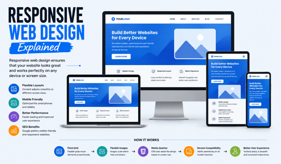
Responsive web design (RWD) is the approach that allows a website to adapt automatically to different screen sizes, orientations, and devices. Whether someone visits your website from a smartphone or a large monitor, responsive design ensures that the content remains easy to read, navigate, and interact with.
In this article, we will explain everything you need to know about responsive web design, including its principles, benefits, techniques, best practices, and why it is essential for modern websites.
What Is Responsive Web Design?
Responsive web design is a web development approach that makes websites automatically adjust their layout and content according to the user’s screen size and device.
The term “responsive web design” was introduced by Ethan Marcotte in 2010. The main goal is to create a single website that provides an excellent user experience across all devices.
Instead of building separate websites for desktop and mobile users, responsive design uses flexible layouts and media queries to adapt the same website to different screens.
For example:
- A desktop website may display three columns.
- A tablet version may show two columns.
- A smartphone version may display a single column.
Everything changes automatically without requiring users to zoom or scroll horizontally.
Why Responsive Web Design Matters
The majority of internet users now access websites through mobile devices. If your website is not mobile-friendly, you may lose visitors, customers, and search engine rankings.
Here are some reasons why responsive web design is important:
1. Better User Experience
Users expect websites to load quickly and display correctly on every device. Responsive websites improve readability, navigation, and usability.
Benefits:
- Easy navigation
- Improved readability
- Better interaction
- Lower bounce rate
2. Mobile Traffic Growth
Mobile internet traffic has surpassed desktop traffic in many countries. Businesses that ignore mobile optimization risk losing a significant portion of their audience.
Responsive design ensures that users enjoy the same experience regardless of the device they use.
3. SEO Advantages
Search engines prioritize mobile-friendly websites.
Responsive websites offer:
- Better search rankings
- Faster page speed
- Lower bounce rates
- Improved user engagement
Google recommends responsive web design because it simplifies indexing and crawling.
4. Cost Efficiency
Creating separate desktop and mobile websites requires additional development and maintenance costs.
Responsive design allows businesses to maintain a single website for all devices, reducing expenses and saving time.
5. Higher Conversion Rates
A responsive website improves the customer journey.
Users can:
- Read product information
- Fill out forms
- Purchase products
- Contact businesses
without frustration.
This leads to higher conversions and increased revenue.
Core Principles of Responsive Web Design
Responsive web design is based on three fundamental principles.
1. Fluid Grids
Traditional websites used fixed-width layouts, such as 960 pixels. Responsive websites use fluid grids that scale proportionally.
Instead of fixed pixel values:
Fixed layout:
.container {
    width: 960px;
}
Responsive layout:
.container {
    width: 100%;
    max-width: 1200px;
}
Fluid grids ensure that content adjusts smoothly to different screen sizes.
2. Flexible Images
Images must resize automatically according to the screen dimensions.
Example:
img {
    max-width: 100%;
    height: auto;
}
This prevents images from overflowing their containers and breaking the layout.
Flexible images improve performance and usability.
3. Media Queries
Media queries are CSS rules that apply different styles based on screen size.
Example:
@media (max-width: 768px) {
    .menu {
        display: block;
    }
}
Media queries help developers create customized layouts for different devices.
Common Screen Breakpoints
Breakpoints define when the website layout changes.
Here are the most commonly used breakpoints:
| Device | Width |
|---|---|
| Small phones | Up to 480px |
| Large phones | 481px–767px |
| Tablets | 768px–991px |
| Laptops | 992px–1199px |
| Desktops | 1200px and above |
Example:
@media (max-width: 480px) {

}

@media (max-width: 768px) {

}

@media (max-width: 992px) {

}

@media (min-width: 1200px) {

}
These breakpoints help optimize layouts for different screen sizes.
Essential Components of Responsive Web Design
Responsive Navigation
Navigation menus must adapt to smaller screens.
Popular solutions include:
- Hamburger menus
- Collapsible navigation
- Slide-out menus
- Sticky navigation bars
A clean navigation structure improves usability.
Responsive Typography
Text should remain readable on every device.
Example:
body {
    font-size: 16px;
}

h1 {
    font-size: 2.5rem;
}
Using relative units such as:
- rem
- em
- vw
helps typography scale naturally.
Responsive Buttons
Buttons should be large enough for touch interaction.
Best practices:
- Minimum height of 44px
- Sufficient spacing
- Clear labels
- Strong contrast
Responsive Forms
Forms must work smoothly on mobile devices.
Recommendations:
- Larger input fields
- Touch-friendly buttons
- Auto-complete support
- Simple layouts
Responsive Tables
Large tables often break on mobile devices.
Solutions include:
- Horizontal scrolling
- Collapsible rows
- Responsive cards
Mobile-First Design Approach
Modern developers often use the mobile-first approach.
Instead of designing for desktops first, they start with mobile devices and progressively enhance the design for larger screens.
Example:
.container {
    padding: 15px;
}

@media (min-width: 768px) {

    .container {
        padding: 30px;
    }

}
Benefits of mobile-first design:
- Better performance
- Cleaner code
- Improved user experience
- Easier scalability
Responsive Design vs Adaptive Design
Many people confuse responsive design with adaptive design.
Let’s compare them.
| Responsive Design | Adaptive Design |
|---|---|
| Flexible layout | Fixed layouts |
| Uses fluid grids | Uses predefined sizes |
| Automatically adjusts | Loads specific layouts |
| Easier maintenance | More complex |
| Better scalability | Higher development cost |
Responsive design is generally preferred because it offers greater flexibility.
Responsive Web Design Best Practices
1. Use Flexible Layouts
Avoid fixed-width containers whenever possible.
Use:
width: 100%;
max-width: 1200px;
2. Optimize Images
Compress images to improve performance.
Use modern formats:
- WebP
- AVIF
- SVG
3. Test on Multiple Devices
Always test your website on:
- Smartphones
- Tablets
- Laptops
- Desktops
Testing helps identify layout issues.
4. Prioritize Page Speed
A slow website leads to poor user experience.
Improve performance by:
- Compressing images
- Minimizing CSS
- Reducing JavaScript
- Enabling caching
5. Use Relative Units
Prefer:
- rem
- em
- %
- vw
- vh
instead of fixed pixel values.
6. Keep Navigation Simple
Complicated menus can confuse mobile users.
Focus on:
- Clear labels
- Minimal options
- Easy accessibility
7. Maintain Readability
Use:
- Adequate spacing
- Proper contrast
- Readable fonts
- Balanced line heights
Responsive Web Design Frameworks
Several frameworks simplify responsive development.
Bootstrap
Bootstrap is one of the most popular frameworks.
Features:
- Grid system
- Responsive utilities
- Components
- Documentation
Tailwind CSS
Tailwind CSS provides utility classes for responsive design.
Example:
<div class="w-full md:w-1/2 lg:w-1/3">
</div>
Advantages:
- Faster development
- High customization
- Lightweight design
Foundation
Foundation offers responsive components for professional websites.
Features:
- Responsive grid
- Flexbox support
- Mobile optimization
Common Responsive Design Mistakes
Avoid these common mistakes.
Ignoring Mobile Users
Never design only for desktops.
Mobile users represent a significant portion of internet traffic.
Using Fixed Widths
Fixed layouts break on smaller screens.
Always use flexible containers.
Oversized Images
Large images slow down websites.
Optimize all media files.
Small Touch Targets
Tiny buttons frustrate users.
Create touch-friendly elements.
Too Many Pop-Ups
Excessive pop-ups reduce usability on mobile devices.
Use them sparingly.
How Responsive Design Improves SEO
Responsive design directly affects search engine optimization.
Benefits include:
- Better mobile usability
- Lower bounce rates
- Improved page speed
- Higher engagement
- Easier indexing
Search engines reward websites that provide a seamless user experience.
Responsive websites often perform better in search rankings.
Future Trends in Responsive Web Design
Responsive design continues to evolve.
Emerging trends include:
- AI-driven layouts
- Voice interfaces
- Dark mode optimization
- Progressive web apps
- Container queries
- Foldable device support
Developers must adapt to changing technologies and user behaviors.
Tools for Testing Responsive Websites
Useful tools include:
- Google Chrome DevTools
- BrowserStack
- Responsively App
- Lighthouse
- GTmetrix
These tools help developers identify issues and improve performance.
Final Thoughts
Responsive web design is the foundation of modern web development. It ensures that websites provide a smooth, user-friendly experience across smartphones, tablets, laptops, and desktop computers.
By using flexible grids, responsive images, media queries, and mobile-first strategies, developers can create websites that look great on any device.
A responsive website not only improves user experience but also enhances SEO, boosts conversions, and reduces maintenance costs.
As technology continues to evolve, responsive web design will remain an essential skill for web designers, developers, and digital marketers.
If you want your website to succeed in today’s digital world, responsive design is not just a trend—it’s a necessity.
