




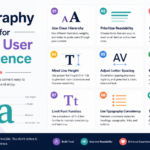

Typography Tips for Better User Experience
Typography is one of the most powerful elements of web design. While colors, images, and animations often grab attention first, typography determines whether visitors can comfortably consume your content. Good typography improves readability, enhances accessibility, strengthens branding, and guides users through your website effortlessly.
Many websites fail not because of poor content but because users struggle to read the information presented. Choosing the wrong font, using inconsistent spacing, or creating poor contrast can frustrate visitors and increase bounce rates.
Whether you’re a web designer, blogger, business owner, or digital marketer, understanding typography principles will help you create websites that look professional while delivering an exceptional user experience.
In this guide, you’ll discover practical typography tips that can transform your website into a more readable, engaging, and user-friendly experience.
What Is Typography?
Typography is the art and science of arranging text so that it is readable, attractive, and effective. It involves selecting fonts, determining font sizes, spacing letters, setting line height, adjusting alignment, and creating visual hierarchy.
Good typography ensures users can quickly understand your content without unnecessary effort.
Typography includes:
- Font selection
- Font size
- Font weight
- Letter spacing
- Line spacing
- Text alignment
- Contrast
- Color
- White space
- Hierarchy
Together, these elements influence how users interact with your website.
Why Typography Matters in User Experience
User Experience (UX) focuses on making websites easy, enjoyable, and efficient to use. Typography directly affects UX because almost every website communicates through text.
Benefits of effective typography include:
- Better readability
- Higher engagement
- Lower bounce rate
- Improved accessibility
- Stronger brand identity
- Faster information scanning
- Increased trust and professionalism
- Better conversion rates
Studies consistently show that users judge website credibility within seconds, and typography plays a major role in that first impression.
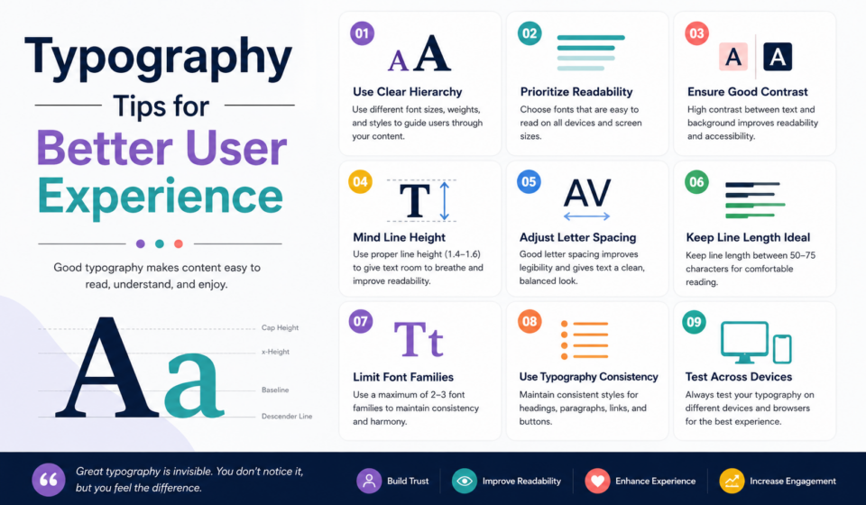
1. Choose Readable Fonts
The first rule of typography is readability.
Avoid decorative fonts for paragraphs. While they may look creative, they become difficult to read over long passages.
Excellent Fonts for Websites
Sans-serif fonts:
- Inter
- Roboto
- Open Sans
- Lato
- Poppins
- Nunito
Serif fonts:
- Merriweather
- Georgia
- Libre Baskerville
- Playfair Display (best for headings)
Readable fonts reduce eye strain and improve comprehension.
2. Limit the Number of Fonts
Too many fonts create visual chaos.
A good website usually uses:
- One font for headings
- One font for body text
Sometimes, a single font family with multiple weights is enough.
Example:
Headings:
Poppins Bold
Body:
Inter Regular
This creates consistency and professionalism.
3. Use Appropriate Font Sizes
Text should be comfortable to read on every device.
Recommended sizes:
- Body text: 16–18px
- H1: 40–60px
- H2: 32–40px
- H3: 24–30px
- Small text: 14–15px
Avoid body text smaller than 16px unless absolutely necessary.
4. Maintain Proper Line Height
Line height (leading) controls the vertical spacing between lines.
If lines are too close:
Users lose their place.
If lines are too far apart:
Reading becomes disconnected.
Ideal line height:
1.5–1.8 times the font size
Example:
16px font
24–28px line height
This significantly improves readability.
5. Keep Line Length Comfortable
Long lines tire the eyes.
Very short lines interrupt reading flow.
Ideal line length:
50–75 characters per line
For blogs, around 65 characters is considered ideal.
Using a proper content width keeps reading comfortable.
6. Build a Clear Visual Hierarchy
Users rarely read every word.
Instead, they scan.
Visual hierarchy helps them find important information quickly.
Use:
- Large headings
- Medium subheadings
- Bold keywords
- Bullet lists
- Numbered lists
- White space
A strong hierarchy guides readers naturally through the page.
7. Use Consistent Font Weights
Avoid random combinations of bold, extra bold, light, and thin text.
Instead, use a simple structure:
- H1 – Bold
- H2 – Semi Bold
- Body – Regular
- Captions – Medium
Consistency creates a polished appearance.
8. Improve Contrast
Contrast determines how easily users can read text.
Best practice:
Dark text on a light background
Examples:
✔ Black on white
✔ Dark gray on white
Avoid:
Light gray on white
Yellow on white
Blue on black
Poor contrast reduces accessibility.
9. Use White Space Generously
White space isn’t wasted space.
It helps users focus.
Benefits include:
- Better readability
- Cleaner layouts
- Improved comprehension
- Modern appearance
Don’t cram text together.
Give headings, paragraphs, and sections room to breathe.
10. Left Align Paragraphs
Left alignment is the easiest to read for most languages written left to right.
Avoid justified text on websites because uneven spacing between words can reduce readability.
Centered paragraphs should only be used sparingly, such as in hero sections or short quotations.
11. Use Responsive Typography
Your typography should adapt to every screen size.
Desktop text that looks perfect may appear enormous on mobile.
Responsive typography ensures:
- Comfortable reading
- Better mobile UX
- Improved accessibility
CSS functions like clamp() make responsive font sizing easier.
12. Create a Consistent Heading Structure
Search engines and users both appreciate logical heading levels.
Example:
H1
H2
H3
H4
Don’t jump directly from H1 to H4.
Proper heading structure improves:
- SEO
- Accessibility
- Navigation
13. Avoid Writing in ALL CAPS
ALL CAPS reduce reading speed.
Instead, reserve uppercase text for:
- Labels
- Small navigation items
- Buttons
- Short headings
Use sentence case or title case for longer content.
14. Highlight Important Content Carefully
Bold text draws attention.
Too much bold text loses effectiveness.
Good uses:
- Keywords
- Important statistics
- Call-to-action phrases
- Key definitions
Avoid bolding entire paragraphs.
15. Pay Attention to Letter Spacing
Letter spacing affects readability.
Too tight:
Words feel crowded.
Too loose:
Words become difficult to recognize.
Headings often benefit from slight adjustments, while body text should generally use default spacing unless there is a specific design need.
16. Maintain Consistent Paragraph Spacing
Paragraph spacing helps separate ideas.
Avoid large empty gaps or no spacing at all.
Consistent spacing improves scanning and overall reading comfort.
17. Use Color Purposefully
Typography isn’t only black text.
Color can communicate importance.
Examples:
Blue links
Red warnings
Green success messages
Gray supporting information
Keep your palette consistent with your brand.
18. Make Typography Accessible
Accessibility should never be an afterthought.
Best practices:
- Minimum 16px body text
- High contrast
- Avoid color-only indicators
- Clear heading hierarchy
- Readable fonts
- Zoom-friendly layouts
Accessible typography benefits every visitor.
19. Optimize Typography for Mobile
Over half of web traffic comes from mobile devices.
Mobile typography should feature:
- Larger tap targets
- Comfortable line spacing
- Responsive font sizes
- Short paragraphs
- Ample white space
Always preview your website on different screen sizes.
20. Establish a Typography Scale
A typography scale creates consistency across your site.
Example:
- H1 – 48px
- H2 – 40px
- H3 – 32px
- H4 – 24px
- Body – 18px
- Small – 16px
Using a scale makes designs easier to maintain and more visually harmonious.
Common Typography Mistakes
Avoid these frequent errors:
- Using too many fonts
- Tiny text
- Low contrast
- Inconsistent heading sizes
- Excessive bold formatting
- Long paragraphs
- Poor line spacing
- Crowded layouts
- Decorative fonts for body text
- Ignoring mobile readability
Fixing these issues can significantly improve user satisfaction.
Typography and SEO
Typography indirectly supports search engine optimization.
Benefits include:
- Increased time on page
- Reduced bounce rate
- Improved user engagement
- Better accessibility
- Easier content scanning
- Clear heading structure
Search engines reward websites that provide excellent user experiences.
Recommended Font Pairings
Some proven combinations include:
Poppins + Inter
Modern and clean.
Playfair Display + Open Sans
Elegant with excellent readability.
Montserrat + Roboto
Professional and versatile.
Merriweather + Lato
Ideal for blogs and long-form articles.
Nunito + Open Sans
Friendly and approachable.
Choose pairings that complement your brand while maintaining readability.
Typography Checklist
Before publishing a page, ask yourself:
- Is the body text at least 16px?
- Is the font easy to read?
- Are there only one or two font families?
- Is the heading hierarchy consistent?
- Is the contrast strong?
- Is there enough white space?
- Are paragraphs short?
- Does the page work well on mobile?
- Are important points easy to scan?
- Is the design visually consistent?
If you can answer “yes” to these questions, your typography is likely supporting a great user experience.
Final Thoughts
Typography is far more than choosing attractive fonts. It shapes how users interact with your website, understand your content, and perceive your brand. Thoughtful typography improves readability, accessibility, engagement, and trust, making it one of the highest-impact design decisions you can make.
By applying the principles in this guide—selecting readable fonts, maintaining clear hierarchy, optimizing spacing, ensuring strong contrast, and designing responsively—you’ll create websites that are both visually appealing and easy to use.
Remember, exceptional user experiences are often built on simple, consistent typography rather than flashy effects. Invest time in refining your typography, and your visitors will reward you with longer sessions, higher engagement, and greater confidence in your brand.
Frequently Asked Questions (FAQs)
What is the best font size for website body text?
A body font size of 16–18px is generally recommended for comfortable reading across desktop and mobile devices.
How many fonts should I use on a website?
Limit your design to one or two font families. This creates consistency and keeps your interface clean and professional.
Why is typography important for UX?
Typography affects readability, accessibility, visual hierarchy, and overall usability, making it a core element of a positive user experience.
What is the ideal line length for reading?
Aim for 50–75 characters per line, with around 65 characters being ideal for long-form content.
Does typography impact SEO?
While typography is not a direct ranking factor, it improves user engagement, readability, and accessibility—all of which can positively influence SEO performance.
